©2021 Reporters Post24. All Rights Reserved.
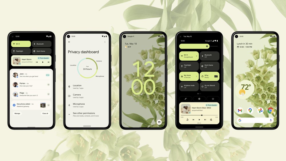
Google is announcing the latest beta for Android 12 today at Google I/O. It has an entirely new design based on a system called “Material You,” featuring big, bubbly buttons, shifting colors, and smoother animations. It is “the biggest design change in Android’s history,” according to Sameer Samat, VP of product management, Android and Google Play.
That might be a bit of hyperbole, especially considering how many design iterations Android has seen over the past decade, but it’s justified. Android 12 exudes confidence in its design, unafraid to make everything much larger and a little more playful. Every big design change can be polarizing, and I expect Android users who prefer information density in their UI may find it a little off-putting. But in just a few days, it has already grown on me.
There are a few other functional features being tossed in beyond what’s already been announced for the developer betas, but they’re fairly minor. The new design is what matters. It looks new, but Android by and large works the same — though, of course, Google can’t help itself and again shuffled around a few system-level features.
I’ve spent a couple of hours demoing all of the new features and the subsequent few days previewing some of the new designs in the beta that’s being released today. Here’s what to expect in Android 12 when it is officially released later this year.
:no_upscale()/cdn.vox-cdn.com/uploads/chorus_asset/file/22520874/1._Android_12_Keyword_Header.jpeg)
MATERIAL YOU DESIGN AND BETTER WIDGETS
Android 12 is one implementation of a new design system Google is debuting called Material You. Cue the jokes about UX versus UI versus… You, I suppose. Unlike the first version of Material Design, this new system is meant to mainly be a set of principles for creating interfaces — one that goes well beyond the original paper metaphor. Google says it will be applied across all of its products, from the web to apps to hardware to Android. Though as before, it’s likely going to take a long time for that to happen.
In any case, the point is that the new elements in Android 12 are Google’s specific implementations of those principles on Pixel phones. Which is to say: other phones might implement those principles differently or maybe even not at all. I can tell you what Google’s version of Android 12 is going to look and act like, but only Samsung can tell you what Samsung’s version will do (and, of course, when it will arrive).
The feature Google will be crowing the most about is that when you change your wallpaper, you’ll have the option to automatically change your system colors as well. Android 12 will pull out both dominant and complementary colors from your wallpaper automatically and apply those colors to buttons and sliders and the like. It’s neat, but I’m not personally a fan of changing button colors that much.
/cdn.vox-cdn.com/uploads/chorus_asset/file/22520883/3._Android_12_Color_Extraction.gif)
The lock screen is also set for some changes: the clock is huge and centered if you have no notifications and slightly smaller but still more prominent if you do. It also picks up an accent color based on the theming system. I especially love the giant clock on the always-on display.
Android’s widget system has developed a well-deserved bad reputation. Many apps don’t bother with them, and many more haven’t updated their widget’s look since they first made one in days of yore. The result is a huge swath of ugly, broken, and inconsistent widgets for the home screen.
Google is hoping to fix all of that with its new widget system. As with everything else in Android 12, the widgets Google has designed for its own apps are big and bubbly, with a playful design that’s not in keeping with how most people might think of Android. One clever feature is that when you move a widget around on your wallpaper, it subtly changes its background color to be closer to the part of the image it’s set upon.
I don’t have especially high hopes that Android developers will rush to adopt this new widget system, so I hope Google has a plan to encourage the most-used apps to get on it. Apple came very late to the home screen widget game on the iPhone, but it’s already surpassed most of the crufty widget abandonware you’ll find from most Android apps.
Source: theverge.com