©2021 Reporters Post24. All Rights Reserved.
Adobe has made changes to its Premiere Pro user interface with the addition of a new import mode, export mode, and a new simplified header—an update that is labeled as “Phase One.”
Now in public beta, Adobe has made some new updates to Premiere Pro with the intention to begin the process of modernizing the software and making it “easier to learn, more efficient, and more enjoyable.”
Noting the desire to make Premiere as beginner-friendly and unimposing as possible, Adobe Premiere Pro has created some new ways of starting new projects and getting them out of the software once they’re completed. Incremental as they are overall, the changes show a nice simplification of some of the common workflows and processes inside of Premiere—perhaps building to some bigger changes in the future.

Unified Header
A more basic “quality of life” style change they’ve made is a much more simplified and unified header. You can still quickly swap between various workspaces and find what you need very quickly (with a full-screen viewing button right there in the header), but there are no longer dedicated tabs for the stock Adobe workspaces at the top. As someone who only uses my own custom workspaces, this is a welcome change.
They’ve also beefed up the “quick-export” button on the top header, so you can just hit that and choose a quick export preset, and your video is well on its way to your hard drive.
The new header only has three main tabs. Import, Edit, and Export. Nice and clean.

Import Mode
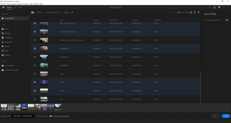
With a focus on getting you started actually interacting with your project media instead of being sent to a giant empty grey screen or dialog pop-ups with a lot of codec related questions (that some users may be frightened by), hitting the “New Project” button will now launch a new window called “Import Mode.”
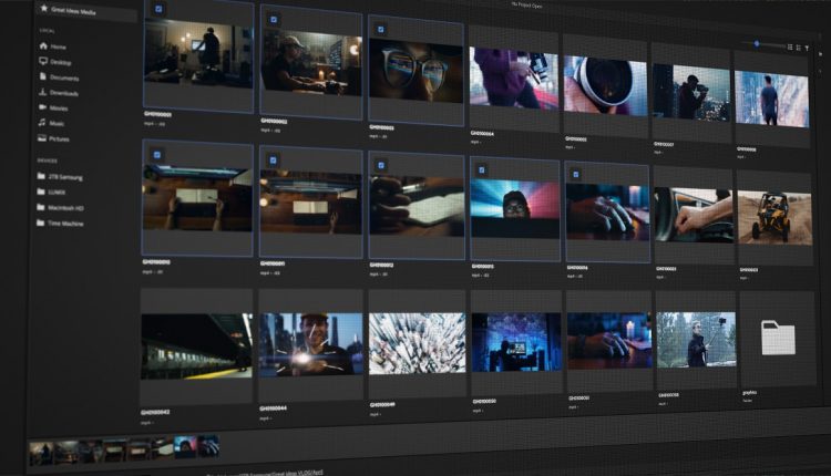
With Import Mode you’ll immediately be looking at clips and media that you can hover-scrub and scan through (similarly to looking at bins in the project panel). As you navigate through directories, you can add folders to your “favorites” for easy access, and click and add various clips to a tray to be added to your project.
When you create a project with files added to the tray, your project will include any of that media already inside of it. They also have an option to create a sequence with the media in the tray, which would obviously be a great feature for watching dailies or rough string-outs.

Export Mode
The new export window looks really nice.
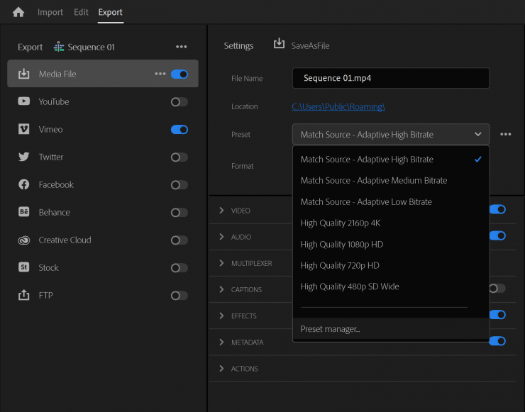
There is a new preset manager that allows you really quickly and easily swap through your different output formats rather than having to dig through different container formats and codecs in order to get from h.264 delivery to ProRes 422, etc. It’s all easily accessible in one spot.
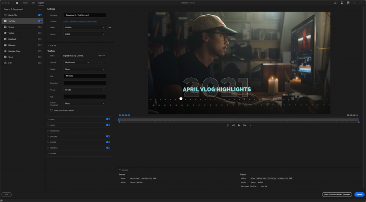
They’ve also added the ability to upload directly to YouTube, now with the ability to set your privacy on the upload, so it doesn’t automatically go live. There are quite a few other output options there as well (Vimeo, Twitter, and Facebook to name a few).
The best feature of the new Export Mode is that it allows for multiple sequential exports with different output destinations and formats. Basically, this will save you from needing to hop over to Adobe Media Encoder every single time if you just need to have a couple of different versions of your file.
Source: nofilmschool.com


