©2021 Reporters Post24. All Rights Reserved.
WordPress 5.8 is slated for release on July 20. In just over a month, many users will get their first taste of one of my favorite new features: template-editing mode.
The template editor is a new tool that allows end-users to create custom templates without ever leaving the post-editing screen. It exists as a stepping stone toward the eventual site editor, a feature that will hand over complete design control to those who want it.
The downside to the new feature in WordPress 5.8 is that users will not have access to their theme’s header, footer, sidebar, or other template parts. It is a blank slate in which they must put on their design caps to create the entire page.
With these limitations in place, what is the point of the template editor launching with WordPress 5.8?
Landing pages.
A blank slate is not always a bad thing. There is a reason all the best themes include page templates named Blank, Empty, Canvas, Open, or something similar. Sometimes users want control over the entirety of the page’s output. And WordPress 5.8 is bringing that capability to every WordPress user.
I have been editing templates for months now, but always in the context of a block theme. I have built both a photography portfolio and WordCamp landing page as part of the FSE Outreach Program. Despite some hiccups, it has been a worthwhile journey being involved as the feature has come to fruition. However, most of my testing was on top of the TT1 Blocks theme.
It was time to put it to a real-world test with themes that are actually in wide use.
Will It Work With My Theme?
The question many users will have on their minds will be: will this new template editor work with my theme? The answer is that it depends. Generally, yes, it will work to some degree. However, because older designs were not created with the template editor in mind, not all experiences will be the same.
I wanted to really put this theory of working with every theme to the test. So, I loaded up Twenty Fifteen, one of my favorite default themes from the past decade.
Perhaps I jumped too far back.

The block editor did not exist back when Twenty Fifteen was built. Its use of a box-shadow technique on the page background meant the entire page had two colored columns running down it. The design team had to use some hacky methods for equal-height sidebar and content backgrounds. Ahhh…the good old days before developers had access to CSS flex-box and grid.
It is these sorts of problems that could limit some older themes. In the case of Twenty Fifteen, I could hide the background with a Group or Cover block over the top of it.
Users will likely get better results when using something more modern, at least a theme built during the block era. Even something as simple as wide-alignment support will change the WYSIWYG nature of the template editor. If a theme does not support the feature, the front end will not match the editor.
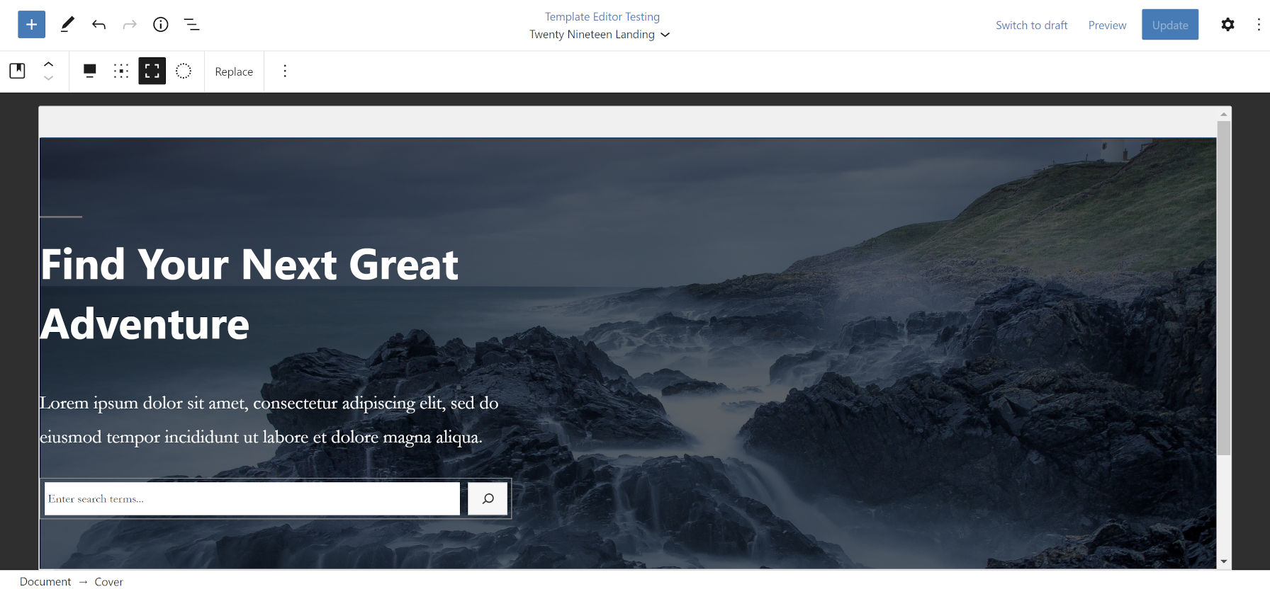
I jumped ahead a few years. Twenty Nineteen was the first default WordPress theme to support blocks. It is old but not ancient in internet years.
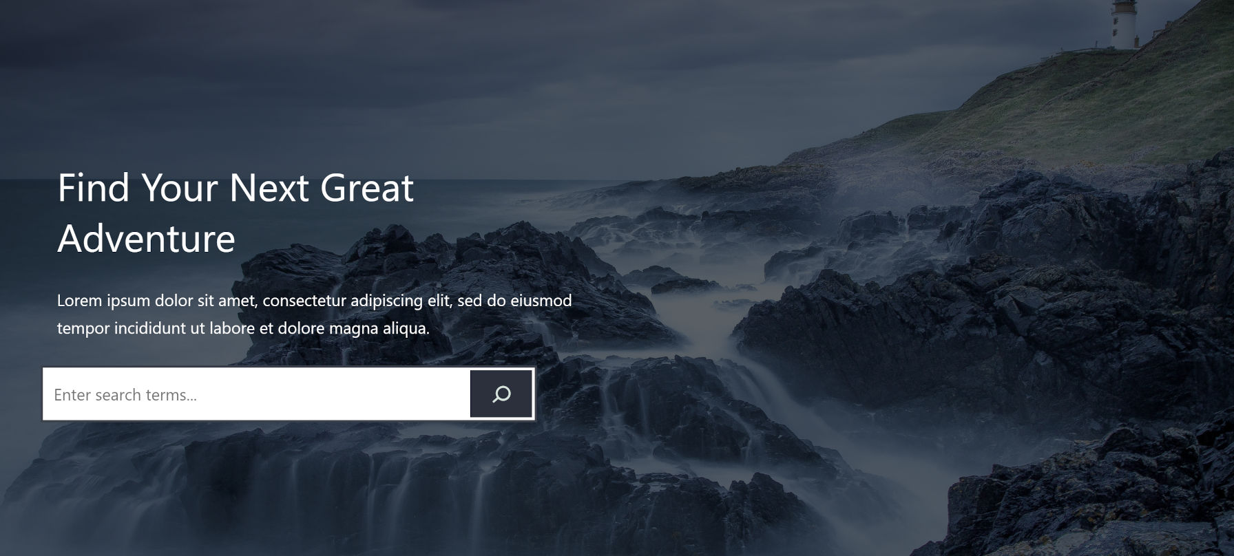
There are some differences between the editor and front-end views. The Cover block padding is off, the vertical spacing does not match, the search input’s font size is different, and the search button’s border radius is round on the front end. However, it is nearly a three-year-old theme now. It held up better than expected in this simple test.
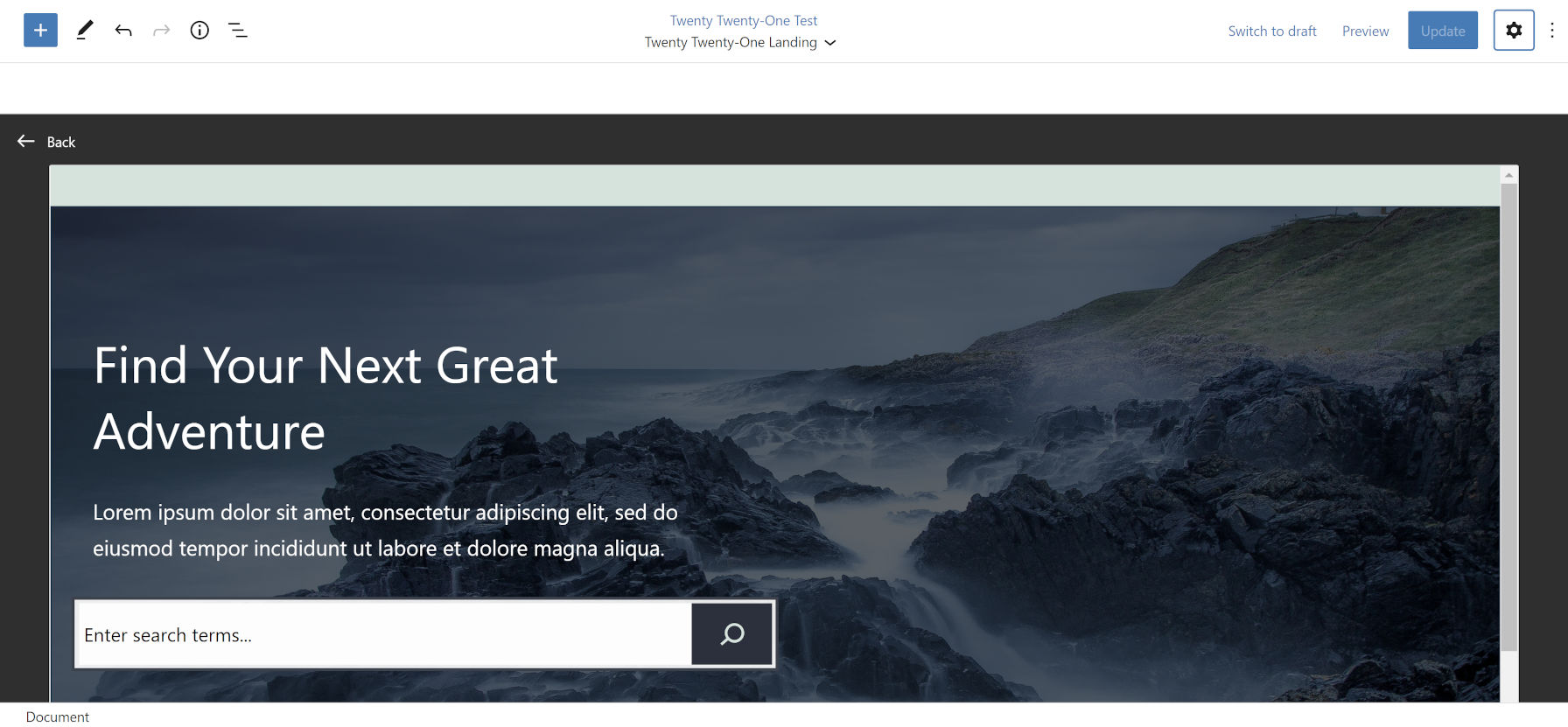
Jumping ahead a couple of years, I activated Twenty Twenty-One, WordPress’s most recent default theme.
The editor is a pretty close approximation of what you see on the front end. The most noticeable differences are the inconsistent padding for the Cover block and the light gray border for the search input field in the editor view.
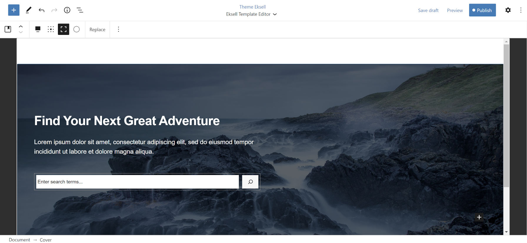
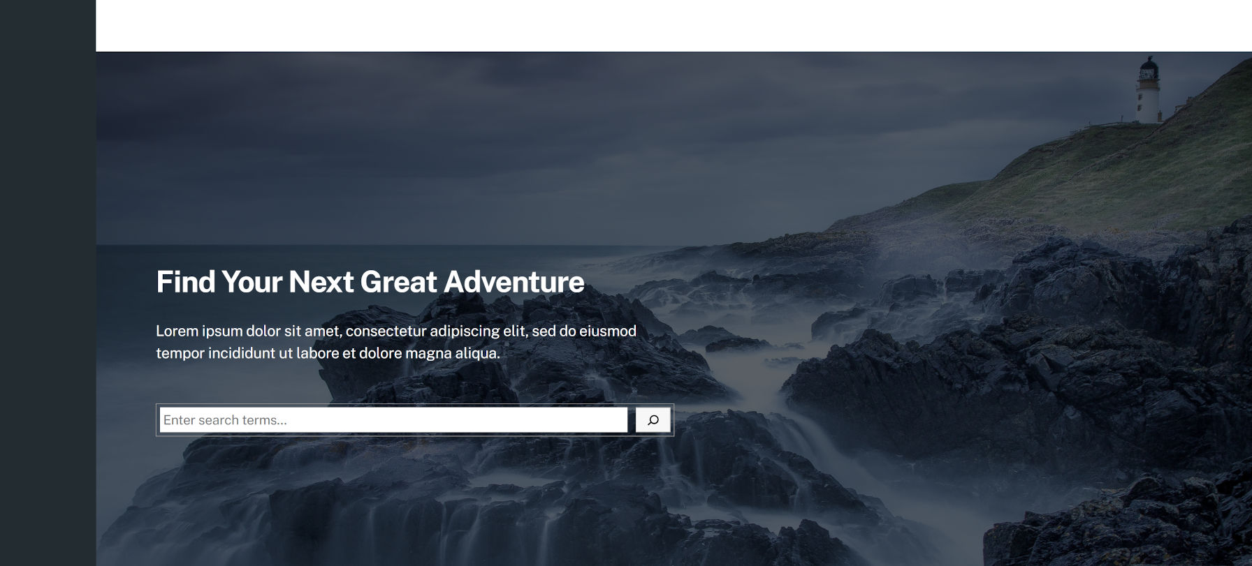
It was time to put the template editor to the “real” test. I activated the latest version of Eksell, one of the most well-rounded block themes in existence.
Obviously, the theme outputs a black section on the left. That is intended for the theme’s sidebar/menu flyout. However, because the user has no access to the template part that outputs that element, it may be impossible for some to create custom templates with this theme. I am sure that Anders Norén, the developer, will address this problem.
Similar, unknown issues will arise with the many thousands of themes in the wild. It does not mean a theme is necessarily bad. It just means it was not built with the template editor in mind. Users may need to throttle back their hopes a bit until they have thoroughly tested template-editing mode with their active theme.
Oh, and that ugly whitespace that shows the content background at the top of the editor? You will see that with literally every theme. I am clueless as to why the development team thought that it would make for a good default. Nearly every web design I have looked at over the years zeroes out the page’s <body> element padding.
For those theme authors who are reading, you will need to deal with this. If you have already been building for the block editor, you are likely a pro at handling such quirks.
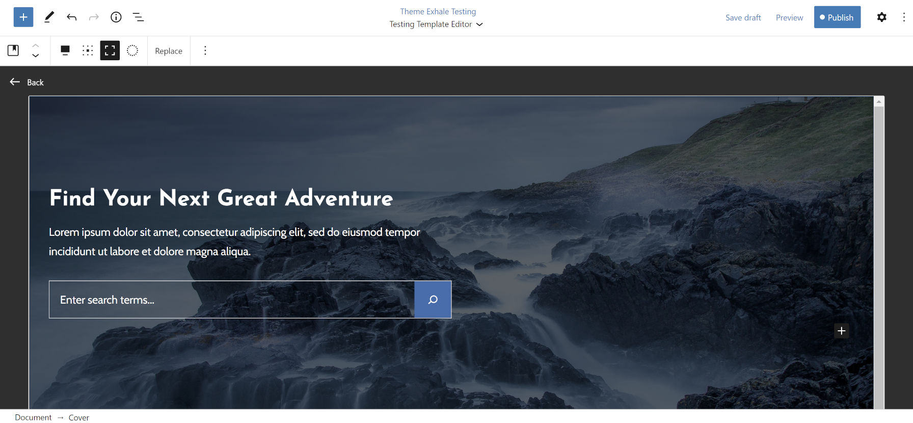
If we look at a custom theme I have been building, you can see no alignment issues between the editor and front end.
The difference for my theme is that I am building when the template editor is already a part of the Gutenberg plugin. The others were all created earlier. It is not fair to compare them. However, users should know that older themes might not work well. They may need to wait for updates or try out a fresh design before taking advantage of template editing.
I also chose Twenty Nineteen, Twenty Twenty-One, and Eksell because they were designed by professionals in our industry and were released in the last few years. They each hold up well but have a few issues that would be trivial to fix.
All of this is to say that results may vary — wildly.
The Ideal Way To Use the Template Editor
My fear with the template editor is that users will begin mixing their content directly into the editor. It is an issue I brought up during round #7 of the FSE Outreach Program. Ultimately, it is a question about the boundary between content and template.
Traditionally, theme authors would build custom templates for their end-users to apply to their pages. Unless those users knew how to make direct code changes, they only selected the template and edited their own content via the editor. It was always clear where content editing ended and template editing began.
The new mode muddies the waters a bit. Because users have direct access to change the template from within the post/page editor itself, I have no doubt that many will create the entire page’s content from within the template editor.
Even I made the mistake of putting what would typically be content in my example templates above. This was purely for illustration.
There is nothing wrong with this if it the user’s intention. However, templates are generally meant for controlling the layout of the page. Things like the header, footer, and content wrapping element belong within it, while the content itself is stored separately. Templates are also meant to be reused. If you apply the same template to multiple pages, any changes made to that template will update every page.
My recommended starting point is to simply add the Post Content block to the template. You can do so from the block inserter or by pasting in this code snippet:
<!-- wp:post-content {"layout":{"inherit":true}} /-->If you just want a blank/empty template, which is what the editor is good at right now, this is all you need. You can move back to the page editor and unleash your creativity.
Here is the start of a novelist landing page I built from this blank template:
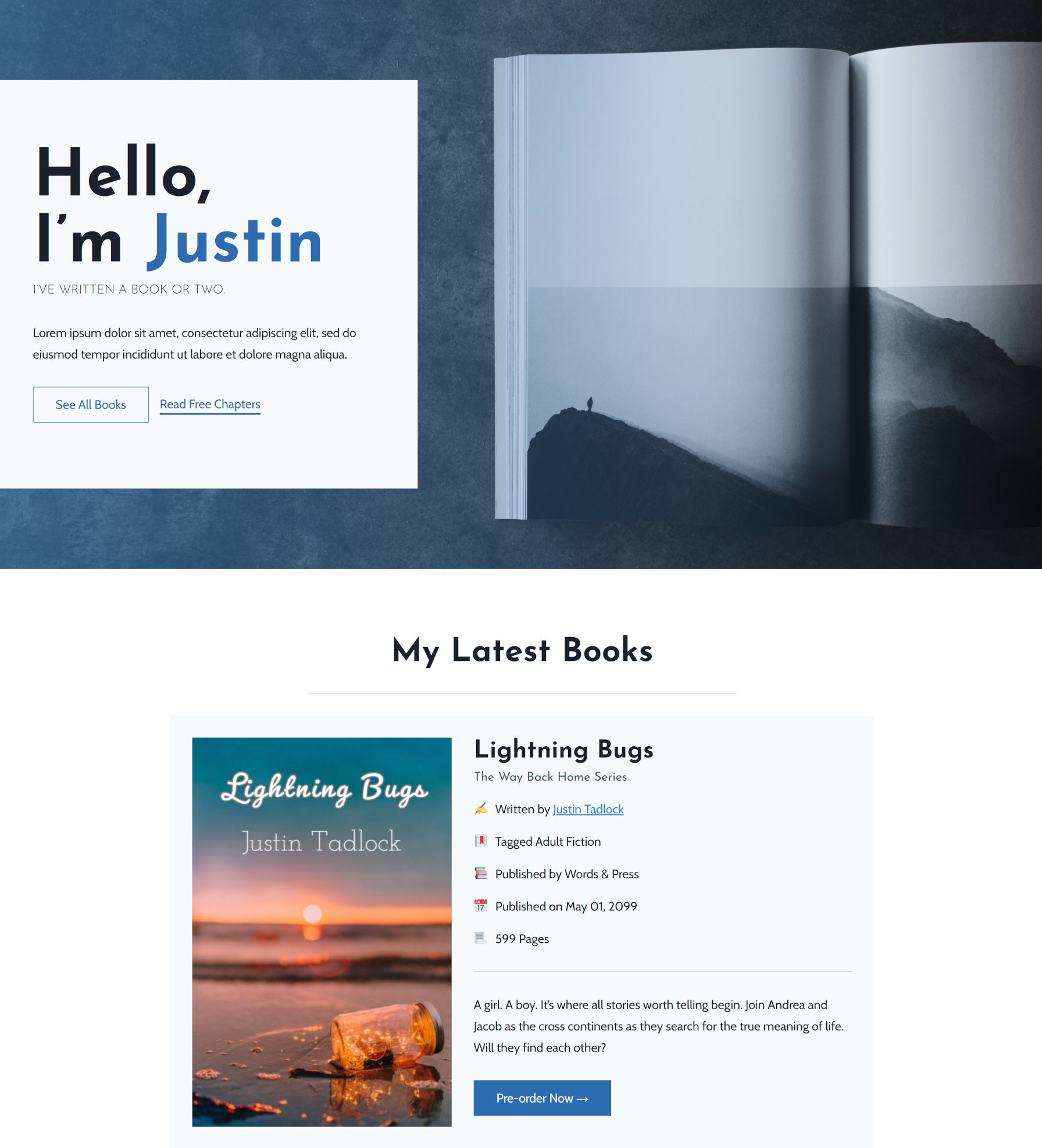
The content of the page was added via the post editor rather than in template-editing mode. This will allow me to create multiple pages using the same open canvas.
If you want to add other layout elements, you can tack them on too. Try mixing and matching the Site Title, Site Tagline, and Navigation blocks as a header. Drop in a Columns block with other blocks to create a “widget area” in the footer.
The power of the template editor is coming with block themes. Eventually, designers will be able to pre-build these templates, and users will customize them. They will also have access to a more robust suite of blocks, such as loading up template parts. However, we have to wait until at least WordPress 5.9 later this year before they become available, and that is not set in stone yet.
Until then, we have a sort-of-OK-but-kind-of-amazing landing page creator.


