©2021 Reporters Post24. All Rights Reserved.
Microsoft recently launched a preview of its new window version.. the successor of Windows 10. Windows 11 has many new updates and features I would like to talk about in this article especially those related to design.
When Microsoft launched Windows 10 I like it because I got frustrated with Windows 8 and now I literally fall in love with the preview of Windows 11 and I’m waiting to get it but for then let’s see some of the design changes I have seen in the launch video.
Lite and Dark Mode

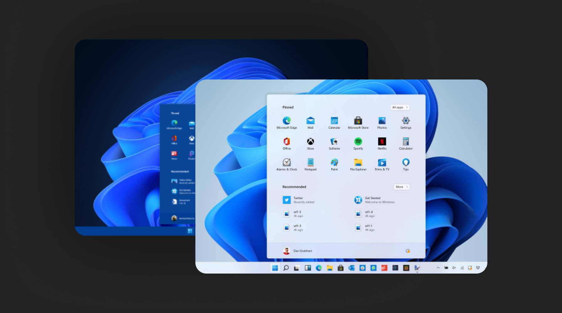
I kind of missing this for years now, Windows 10 doesn’t have a Lite and Dark mode where it’s kind of dark but WIndows 11 have it both, for better viability, looks, and styling whatever the reason Microsoft added it, and I like it.
New Icons


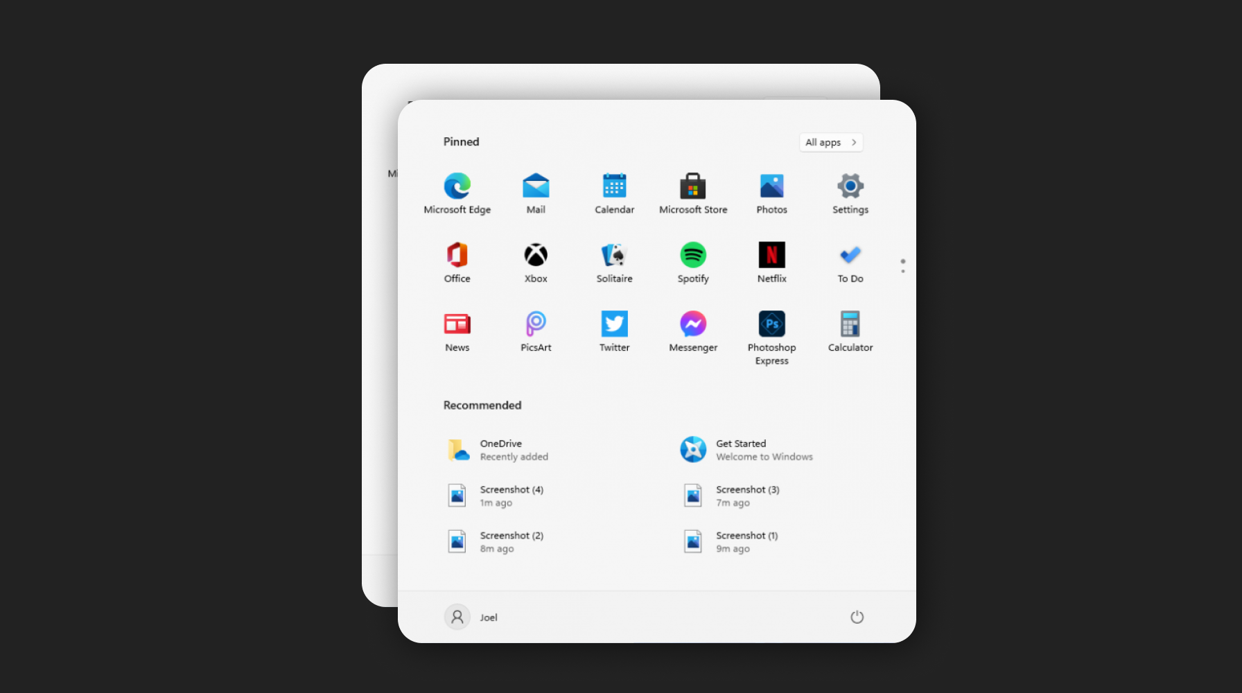
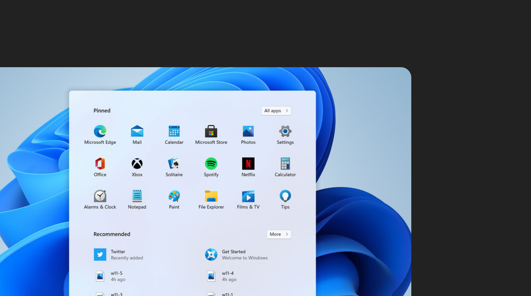
In Windows 11 you’ll see New icons everywhere from tab bar to fin manager and inside the search bar also. and personally, I like them all because of their simplicity and design.
Responsive Multi-Tabs


Windows 11 comes with the cool multi-tab feature with more advanced features of adjusting the responsiveness which makes designers focus on making their application more responsive and adjustable.
Rounded Corners


windows 10 is famous for its rectangular corners but Windows 11 will be different which has bit rounded corners everywhere on screens, inside the apps which kind of look smoother in the interface design.
New Look


I like the overall feel of the new Windows 11, I like the new look and feel of the 11 at least in the visual perspective. I know it is not fully ready and launched till June 24th but in the future when it launched completely I’ll write an article in full detail for discussing it more in terms of UI and design till now enjoy my other articles. thanks for reading.
Source: uxplanet.org


