©2021 Reporters Post24. All Rights Reserved.
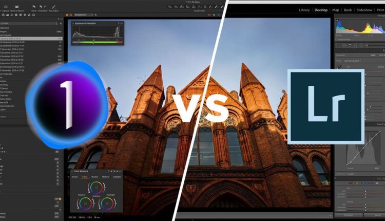
In a lot of my articles, I go on about how incredible Capture One is and how every photographer (with a few exceptions) should switch from Lightroom to Capture One. In this article, we will finally take a deep dive and see for ourselves why it’s worth considering the switch in 2023.
Tethering
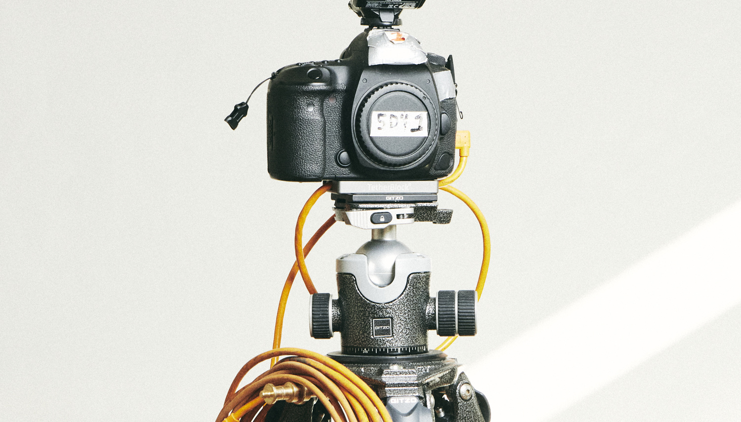
If you are shooting tethered, Capture One is pretty much the only viable option. Having tried tethering into Lightroom exactly once, I saw how inefficient and slow it was. Even on a modern computer, with a 20mp camera, it was still far too slow to be considered adequate for a fast-paced professional workflow. Additionally, Lightroom didn’t allow for the advanced tethering features that Capture One has. Capture One provides more control over your camera, live view, focus adjustment options, and so much more that Lightroom lacks.
The only benefit I see in tethering into Lightroom is being able to see the image you captured on the back of your screen, however, why would you want to do that if there is a full-scale preview available anyways?
So, if you shoot tethered and want a faster, smoother workflow that doesn’t stall production, go for Capture One.
Customizable Workspace & Capture Pilot
This one is another big one for me, as I tend to use my laptop in combination with a monitor, as well as a phone. For workspace for photoshoots is vastly different from my editing workspace. Because I don’t want people tampering with anything on my computer besides rating and tags, I set up the workspace for shooting to only display the image, file name, star rating, and color tag. While the client sees this, I can be at the back making some adjustments via my laptop and displaying them on the big screen to the client.
Another big one for me is Capture Pilot. Capture One allows users to connect to a local network and preview as well as rate the images. This app is completely free, and I love using this on big productions to make sure that the client has their own preview and is not crowding the monitor area. This is also useful for me as I can be far from the monitor but check images on my phone easily.
Export Menu
I always deliver my files in at least two formats: full-res and web. This helps my clients save time and upload an image that is plenty for social (web), while also giving a full-resolution file to crop, adjust and print on large format media. Usually, however, there are even more formats that the client requests. You often find yourself having to export the same image in multiple variants, sizes, and versions. This is exactly where the proven recipes and the export menu of Capture One are irreplaceable.
The ability to create custom process recipes, save them and use them over and over again for a specific client or purpose has saved me hours of time. The ability to make each recipe export to a particular folder, have the file named after the version it was exported as, and be able to track what was exported and what was not is a game-changer for my workflow. It just helps me keep everything organized, especially on large productions. This all may sound unnecessary to a beginner photographer, which is where Lightroom wins: its export menu is simple and easy. Then again, I don’t see Capture One’s menu being that hard to navigate. 
Session Functionality & Organization
Another bonus of Capture One over Lightroom is the ability to make each production into a session. I title my sessions in the following format: dd—mm—yyyy-shoot-description. This helps me to determine what happened and when. Each raw file captured in that session is also named like this, as well as each exported file contains the name of the raw file and +the export version (full-res, web, etc).
Each shoot is a session, which gets its own name. Capture One will create 4 folders: Capture Output, Selects, and Trash. All of the files that I shoot go into capture, finals go to Output, and retouched images go into Selects. This way, all of my shoots are organized, and I can easily navigate thousands of images to find the one I want. Unfortunately, lightroom does not provide photographers with this functionality, which often leaves you disorganized and looking for files in the wrong places.
Raw Image Processing
A lot of photographers tend to say that Capture One processes colors in a more natural film-like way. This leaves Lightroom users with a clinical, almost too perfect, version of the same file. While being a valid point, I think it’s too vague and out there to be able to base an argument over. Instead, I want to talk about the ease with which Capture One lets you do post-production. In Lightroom, the editing panel is condensed to a develop tab. There you will find all adjustments, including color grading. I found Lightroom to prompt me to use the more basic sliders, and never actually go down to color grading. At the same time, one of the first things I discovered about Capture One was the ability to color grade like never before.
Nowadays, I love playing with their color grade panels, and especially a tool unique to Capture One: skin tone. This tool alone was enough for some photographs to make the switch from Lightroom to Capture One. It essentially reduces the amount of retouching you have to do, and sometimes, there is virtually no retouching you need just because of how capable this tool is.
Closing Thoughts
To close off this article, I want to say that I still sort of use Lighroom. Not to edit or process images, but to catalog them. The organization within a session is good for one shoot, but when I have to sort through thousands of final photos, I do prefer lightroom. So at the end of the day, while 90% of everything I do is in Capture One, a small fraction of my workflow is still in Lightroom. My advice to someone who is on the fence between the two: go Capture One or go home.
What is your experience with using Capture One and Lightroom? Which one do you prefer? Let us know in the comments!


