©2021 Reporters Post24. All Rights Reserved.
If there’s a theme of Apple’s operating-system releases in 2021, it’s platform unification. This development is most significant for macOS, which tended to lag behind iOS in the 2010s, missing out on some or all of the year’s exciting innovations.
Apple has spent the last few years getting the base technology of iOS and macOS back in sync, removing 32-bit software, adding Mac Catalyst and support for iOS apps on Apple silicon, and introducing new cross-platform development technology via SwiftUI. And with macOS Monterey, you can see the fruits of all that labor: The big new features of iOS 15 and iPadOS 15 are also the big new features of macOS Monterey.
The Mac is also getting a boost with older iOS features finally being brought to the other side, most notably Shortcuts, the iOS automation tool that is the first sign of a renaissance of user automation on macOS.
The good news is, for all the recent fears among Mac users that Apple might be attempting to collapse Mac, iPhone, and iPad into a single amorphous product, macOS Monterey still feels unreservedly like a Mac. Apple wants its platforms to share features, but it also recognizes that each serves a different (albeit overlapping) audience.
With the release of the first public beta versions of macOS Monterey (as well as iOS and iPadOS 15), everyone now has the opportunity to give these new operating systems a try. As always, be warned that they’re not ready for release for a reason, and you should never install beta operating systems on devices that you depend on to do your job day-to-day. For those with patience, consider this a preview of what your Mac might look like this fall. For those without patience, well, let’s take a look at Apple’s work in progress that will be taking shape this summer.
The trouble with Safari 15

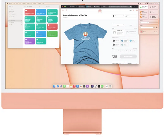
The thing about platform unification is, if Apple makes a dramatic move to change its software, it now does so across all of its platforms. And this year, Apple has chosen to make dramatic interface changes to Safari across not just macOS but iOS and iPadOS as well. I think the changes work fairly well on the iPad, but they’re kind of a mess on the iPhone and, unfortunately, the Mac.
The new version of Safari collapses the traditional two-row interface at the top of the browser into a single row. I guess we should’ve seen this coming: Apple’s been collapsing window chrome and toolbars for a few years now on the Mac. And I get the impulse: While I mostly use macOS on a 27-inch iMac display, most Mac users are on small laptop displays, and on small widescreen displays, every vertical pixel saved is crucial. (I spent years using an 11-inch MacBook Air as my primary Mac, so I do understand the desire to save space.)
But this design change is a bridge too far. By cramming the bulk of its browser interface into a single row, it’s had to make too many sacrifices—and they don’t outweigh the benefits gained by saving space.
Moving tabs into the same space as all the other interface elements forces them all to get smaller. Once you’ve got more than two or three tabs open, the tab’s title gets so truncated that it’s almost impossible to tell at a glance which tab is which. If you’ve got multiple tabs from the same website—so there’s not even a favicon to differentiate them—you might as well give up.
To make matters even worse, the background color of the entire top of the Safari window is now matched to the color of the website you’re viewing. It’s a cute trick, but while I understand the desire to make Safari feel more like it’s a part of the content it’s displaying, it’s a readability disaster. Contrast with the text on tabs is frequently poor, and since the color shifts depending on which tab is active, it feels like my brain is constantly recalibrating how to read that particular text contrast. On top of that, there’s also the cognitive dissonance of seeing tabs for sites with a strong color identity displayed in a different color because they’re not the currently active tab. And you can’t see the title of the page you’re currently viewing, because the URL displays instead unless you hover the pointer over it.
Because the address bar is embedded in individual tabs now, it also means that when I type Command-L or Command-T, I have to hunt down the place where that URL is being entered—the URL box jumps around based on the location of the particular tab I’m currently using.
A lot of user interface elements have also been hidden away to provide more space for tabs. Tasks that were once a click away sometimes need to be searched for in a sub-menu.

One of the other major new features of Safari 15 is a reaction to how many people use many, many browser tabs. It’s Tab Groups, which lets you have multiple sets of open tabs that you can toggle between, meaning you don’t need to have dozens of tabs open in a single window or scattered across multiple windows. Instead, you can keep tab sets for various tasks in their own groups and toggle between them.
Even better: Tab Groups sync via iCloud, so any of your Apple devices running iOS 15, iPadOS 15, or macOS Monterey will show the very same pages in the same groups. And these aren’t bookmarks: If you’re in a Tab Group and open a new tab, it goes in that group and syncs to all other devices. If you navigate to a different page, the group gets updated. Apple is trying to improve browsing by allowing you to get your tabs in order and have them available wherever you happen to be. It’s not a feature for everyone, but it’s smart, works pretty well, and will be a boon for many users.
But I have to ask: How can the same company that developed Tab Groups create an interface design that makes tabs unreadable? With one hand, Apple seems to understand that tabs are important and could use a 21st century upgrade; with the other hand, it cuts off all but the first few words of the tab title and obscures the text behind an ever-changing background color.
There’s one more new feature in Safari: iCloud Private Relay. It’s a feature that’s designed to make it much harder for anyone on the Internet to determine your identity and track you by obscuring your device’s internet address; traffic from Safari is sent through an Apple server and then an independent company’s server. Your Internet address should still reflect your general region for broad geolocation purposes, but it can’t be used to personally identify you.
As someone who has advocated for Apple to go all the way and offer a VPN service, I’ve got to applaud iCloud Private Relay. It doesn’t encrypt all traffic on your Mac, but captures all your Safari traffic and anonymizes that. That seems to be a pretty good combination of giving users privacy without overwhelming Apple’s servers with a staggering amount of traffic to relay.
That all said, I have to mention that iCloud Private Relay is only available to people who pay for iCloud. If you’re paying for even a tiny amount of expanded iCloud storage space (including if you’re in an Apple One bundle), you get iCloud Private Relay. If you’re not paying, you don’t get it. This makes perfect sense because routing that much network traffic on an ongoing basis can’t be cheap.
And yet… this feature also gives me pause. While I admit that it’s logical to charge for network-based features like this, I can’t help but be a little bothered by the fact that there’s a major new privacy feature in macOS (and iOS, and iPadOS), but it’s not available unless you enroll in a recurring payment to Apple. I don’t think we’re standing on the edge of some sort of slippery slope that will lead to Apple splitting its platforms so that there are some new features for everyone and some only for those who are willing to pay… but given Apple’s recent focus on enhancing services revenue, I wonder sometimes how that business decision might distort the choices it makes in developing the software that runs its products.
Shortcuts

As someone who uses automation on my devices to make my life easier, I am pleased to report that macOS Monterey brings Shortcuts from iOS to the Mac. And this is no halfway approach: Shortcuts is the centerpiece of where Apple is going with automation across its platforms, and this is a bold first step.
Shortcuts offers a redesigned interface that’s consistent across Mac, iPad, and iPhone. Like Automator, Shortcuts is a tool that aims to make automation easier for non-programmers by building automations out of individual blocks of functionality which can be supplied by the operating system or by individual apps. On iOS, Shortcuts far surpassed what Automator was capable of doing, thanks to its sophistication and the support of many third-party iOS apps, which lent their capabilities to the palette of options within Shortcuts.
Given Shortcuts’s history as an iOS app, it wouldn’t be surprising if Apple had chosen to take baby steps in macOS Monterey. Perhaps it would limit Shortcuts to apps that originated on iOS, either via Mac Catalyst or running directly on Apple silicon?
That didn’t happen. The creators of “classic” Mac apps can add support for Shortcuts directly into their apps, and Apple has built bridges to connect all of the different automation utilities currently present on macOS. Shortcuts can run AppleScript scripts and shell scripts, command-line tools can run Shortcuts or AppleScript scripts, and AppleScript scripts can execute shell scripts or run Shortcuts.

Though Shortcuts has already surpassed Automator in terms of ease of use as well as functionality, it’s still a very young app—there’s plenty of room to grow over the next few years. Only with this version can you hide steps of a shortcut to make the rest of the file easier to read, for example. Shortcuts also shows its new arrival on the Mac by generating dialog boxes and alerts that look nothing like standard Mac interface elements. In the end, either Shortcuts needs to feel like the rest of macOS or the rest of macOS needs to come to Shortcuts—but right now, it’s neither fish nor fowl.
I also hope that the arrival of Shortcuts provides an impetus to push macOS’s automation integration forward. In addition to offering a menu-bar item from which you can run shortcuts, Shortcuts for Mac mostly follows the paths that were previously available to Automator actions: A presence in the Services menu, items that can appear under the Quick Actions submenu in Finder, on the Touch Bar, and in Finder’s Preview pane. I should be able to place an individual shortcut, or a Shortcuts icon, right on the toolbar in Finder.
Though we’re early in the beta process, I’m already impressed with the compatibility of Shortcuts on the Mac. I was able to check a couple of boxes (to enable Mac support) and get complex shortcuts that I built for iOS to run on the Mac perfectly, no additional changes required. And Shortcuts includes a command that lets you determine which device is running, so a shortcut can run one way on the Mac and a different way on the iPhone or iPad. That’s a lot easier than keeping two different shortcuts in sync.
I appreciate Apple characterizing the arrival of Shortcuts on the Mac as the beginning of a years-long process. Not only does that imply a level of commitment to user automation on the Mac that I’ve wanted to hear for years, but it acknowledges that there’s more work to do. If Shortcuts is the future of automation on the Mac, what’s the future of scripting? Is AppleScript, which dates back to the 1990s, going to be retired? And if so, what will replace it? There should be room for a scripting language that can be more agile and powerful than the building-block approach of Shortcuts. Similarly, what will happen to the Apple Events framework that allows apps to be controlled remotely? Will it be replaced, and if so, how?
This is where iOS is also lacking. Apps on iOS can rarely (if ever) be controlled to the same level of detail as they can be on the Mac. If Apple can determine what the future of scripting and app control will be on the Mac, perhaps that will be a unified approach that will also work on its other platforms. I hope so—but in the meantime, Shortcuts for Mac is a great first step that moves the platform forward without closing any doors just yet.
Platforms together, architectures apart
Just as Apple is bringing its platforms closer together, the Mac is in the midst of an architecture transition. In come Apple-designed processors (currently just the M1, although more are surely on the way), and out go Intel processors.
Obviously, there will come a day when macOS is no longer available for Macs on Intel processors. (Relax—I imagine it will be a few years, yet.) But macOS Monterey begins the transition by offering a few features that don’t work on Intel Macs.

In many cases, it’s the bringing of the many platforms together that is the reason for the separation of features across chip architectures. Many of the new features in macOS Monterey are taking advantage of specific features of the Apple chip architecture. So FaceTime on Intel Macs won’t offer to fuzz out your display in “portrait mode,” nor will it scan your photos and convert them to copyable text, nor will it support on-device and unlimited-duration dictation. For those features, you’ll need a Mac with an Apple-designed processor.
This is just the beginning. It’s the way of things, but that doesn’t make it any less painful. Intel Macs are the past. Apple will maintain compatibility for a few years yet, but if a feature can be improved by implementing it in a way that only works on Apple’s processors, that’s how that feature will be implemented. In the autumn of 2023 you’ll probably be able to install macOS 14 Sequoia on that 2018 Intel MacBook Pro, but the snazziest new features won’t be there.
FaceTime and SharePlay: Pandemic lessons learned?

I don’t use FaceTime very often from the Mac, but I do use Zoom a lot—and Apple has added a bunch of new features to FaceTime that aim to close the gap with other, more popular apps for videoconferencing. FaceTime missed its moment during the heights of COVID-19 lockdowns in 2020, but Apple seems to have learned its lesson and is trying to catch up.
FaceTime now supports a new “grid view” that’s more like a Zoom conference call rather than the floating-bubble interface of old. It’s still a little weird and inefficient, but it’s less distracting. There’s support for inviting someone to a FaceTime call via URL, which is long overdue. M1 Macs can add a blurred-out Portrait Mode effect to make their backgrounds blurry.

I find it a little odd that Apple has placed the interface that lets you toggle Portrait Mode on and off in Control Center, of all places. The idea is that microphone and webcam modes are intended to be global settings available to all apps, not just FaceTime. (The settings are even adjustable on a per-app basis.) I don’t think it makes sense for this setting to be in Control Center at all—what are app preferences for, anyway? And why is Apple so afraid to add features to the FaceTime app on the Mac?
I don’t have much to report on group FaceTime based on early betas of macOS Monterey and iOS 15 other than to say that I found them pretty buggy, with video and audio cutting out and individual participants sometimes appearing more than once. It’s early days—but Apple will need to make all of this rock solid if it ever hopes for FaceTime to become an option when all of us already have Zoom, for better or for worse.
It’s also easy to see the new SharePlay feature as a reaction to all those browser extensions that became popular in the early days of the pandemic, the ones that allowed people to watch the same streaming videos simultaneously. SharePlay works with FaceTime to do that for videos, music, and more. There’s built-in screen sharing, too.
It’s a good idea, and if it works, it could be cool—especially since a system-level technology is likely going to be able to execute on this idea far better than a hack made at the browser level. But at the moment, it’s all a bit of a buggy mess. Apple has the summer to make it all come together, and I hope it does.
A new focus on Focus

A few years ago, Apple embarked on a quest to help us manage all the distractions that our devices can cause. (Which is awfully nice of Apple, since its devices were the ones the caused the problem in the first place!) In 2021, it has brought several disparate features together in something called Focus, which attempts to let you control—across all your devices, including the Mac—what people and apps can bug you, and when.
This is an extension of the simpler concept of Do Not Disturb, which is useful when you’re sleeping or driving or trying to focus. But you can set multiple Focus modes and define them in different ways—and again, they sync across your devices, so entering a “don’t bother me, I’m writing my novel” mode on your Mac is not going to just move all your pesky notifications to your iPhone or Apple Watch.
You can define different modes for different situations—imagine a mode where only co-workers can contact you, and a different mode where nobody from work can contact you. You can keep those modes on until you turn them off, or limit them by time or until your current calendar appointment is done.
While I’m still trying to figure out how I’ll use Focus mode in practice, my early experiments are encouraging. When I start writing, I can shut out the world for a set amount of time, with exceptions for close family. I appreciate Apple expending the effort to nudge users to take control of their notifications and consider the appropriate contexts for certain kinds of messages.
Shared With You (for certain apps)

This year, Apple is building a system that allows information that’s been shared via Messages to be surfaced in other contexts. It’s a really smart idea—that the information people send to us is often better served by being presented to us based on what it is, not its presence in a text-message chain.
The result is Shared With You, a section that’s being added to numerous Apple-built apps, including Safari, News, TV, and Podcasts. If someone sends you a picture in Messages, Photos knows about it and can offer to add it to your library. Links your friends send to you can show up in a Shared With You area in the Safari start page. And so on.
Not every suggestion is going to be a hit, and I definitely ran into some irrelevant stuff when using Shared With You. But there were also great successes. After all, sometimes you know that someone sent you a link to a story on the web you want to check out, but you can’t remember who or when. A trip to Messages might find it, but Shared With You in Safari compiling all the links you’ve been sent? That’s far more likely to be a hit.
There’s a lot that could be done with this technology, and this is an interesting first step. But what it really needs is support for third-party apps on both ends of the equation. Other messaging apps, for example, should be able to contribute content to the Shared With You pile. they can also offer shared content in the right context.
A large collection of other features
It’s funny. For a release that at first blush seems to be a less dramatic update—and macOS Monterey really is!—it’s still got a load of changes, far more than I can get to in detail in this first glance. Fortunately, we have all summer to unearth more hidden gems, but here’s a first cut at other additions that are notable:
Universal control. This is actually a banner feature, the ability to control up to three Macs or iPads from a single keyboard and mouse. I’d like to tell you all about it. But the fact is, Universal Control isn’t ready yet. So it will have to wait until later betas.
AirPlay on Mac. Yes, Macs can be AirPlay targets now! You can stream video to Macs via AirPlay! This is probably not going to solve the issue of using your old iMac as an external display (too much latency and compression), but it’s still a cool idea. This one’s not really all there in the beta, unfortunately—in my tests all the video was at the wrong aspect ratio! It’s a beta. I’ll keep an eye on it.
Live Text. Available on M1 Macs only, this feature basically uses an OCR engine to make text inside images accessible. It works remarkably well. I will admit, I used this feature inappropriately to try to read some old handwritten text, and it didn’t fare so well. But it was all in fun. In general, Live Text is pretty cool—and has some amazing accessibility implications, since people like to post images with text inside them, and now macOS can read that text.
Finder niceties. I love a good Finder update. In macOS Monterey, you can resume file copies that have timed out for whatever reason, rather than having to start over at the beginning. That’s so great for large media files. Also, there’s a more accurate pie-slice progress bar on every file as it’s being copied. And this may only be of interest to me, but the Go To Folder command in Finder looks better and works faster. It’s as fast as autocompleting paths in the Terminal, and that’s a good thing.
Memoji in login window. If you hate Apple’s Memoji, I have bad news. (If you like them, it’s good news!) You can now set your Memoji to be your user icon and appear—with animations!—in the login window. It’s cute, sort of.
Passwords in Systems Preferences. Apple has majorly upgraded its cloud-backed password database. It’s all a bit hidden away in the System Preferences app, but it’s a full-featured password manager that will auto-fill to most apps. If you’re just using Apple devices, it may be the only password manager you ever need.
Photos updates. There’s much more here, and I’ll get to it in detail later this summer, but the Photos apps on iPad, iPhone, and Mac continue to converge. On the Mac side, you can now import photos from a different Photos library. Interactive memory movies, a la iOS, are coming to the Mac too—but won’t be there in the initial release of Monterey.
The Quick and the Notes. On iPad, Quick Notes are a really cool idea. On the Mac… ehhh. It’s a global keyboard shortcut to bring up a new note. Floating windows tied to a global keyboard shortcut are a lot less exciting on the Mac, where that sort of thing has been around for decades, than they are on the iPad. Still, Notes has picked up some more interesting features, including support for tags (so you can quickly find any note containing a tag) and at-mentions of users in shared notes.
Apple Maps. The new Apple Maps design, where available, is amazing. It looks like something out of a video game, with randomly placed trees and shockingly accurate streets, right down to the crosswalks and stop signs. Fortunately for me, the Bay Area is already covered. Sorry, Rest of World! It’ll be great whenever you get it.
Low Power Mode. Inspired by the iPhone, the Mac now has a Low Power Mode—and it’s available on both Intel and M1 Macs. Low Power Mode forcibly dims your display and underclocks your processor, all in the hopes of reducing battery drain.
Missed opportunities
Though Apple has been known to surprise us with mid-cycle feature additions, for the most part the company picks an annual set of operating-system priorities and sticks to them. While summer is a time to reflect on what’s new and exciting on Apple’s platforms, it’s also a time to notice what didn’t make the cut—and won’t likely be addressed for at least a year.
Most notably, macOS Monterey does nothing to address the failure of notifications, Notification Center, and widgets from macOS Big Sur. Floating notifications seem to be untouched, so they’re just as obscure and hard to click on as they were in Big Sur. (System alerts are still centered with weird margins, harming legibility for no clear benefit. You’d think there would’ve been a fairly straightforward fix there, but Monterey fails to apply it.)
Even more frustratingly, Apple has left notifications and widgets to live out of sight on the right side of the screen. It would be logical for Apple to allow widgets to live on the Mac’s desktop—the equivalent of the home screen on iOS—but instead, they’re hidden away. I never use widgets on macOS for this reason, despite using them all the time on iOS. Even allowing widgets to pop down from a menu bar icon would be better, since the Mac menu bar is a more appropriate home for glanceable information.
And as for the pile of notifications stacked up in the top half of Notification Center on the Mac: I find them utterly useless. I never look at them, and when I do find the need to see a notification I missed, I can never find it amid the detritus. I don’t know the right solution to a proper Mac version of Notification Center, but this isn’t it.
I’m enthusiastic about the fact that the Mail app is getting a new plug-in format because it suggests that perhaps Apple has a strategy for improving Mail, and this is the first sign of life we’ve had in a while. But it’s a meager thing. We’re all pretty much stuck with email, and many companies have tried to find more intelligent ways to process, filter, and triage email. And yet it feels like Mail is more or less the same app it was when it came on the scene two decades ago.
I can’t believe that Apple thinks Mail was perfected in 2001. I can’t believe that the same company that has applied machine-learning algorithms to identify what breed of cat or dog is in a photo or whether the cadence of your steps indicates that you’re a risk of falling has never considered that perhaps applying some intelligence to our disastrous inboxes wouldn’t have some value. In this very release, Apple is mining text messages for their value and spreading that to other apps—but email just sits there like a lump.
Email apps need to be rethought and reimagined. And while this is most definitely a third-party app opportunity, an awful lot of people use the platform’s stock mail client, and what Mail offers isn’t good enough. (I could say the same for Calendar, too.)
Wait till next year, as the saying goes.
State of the betas
If you’re thinking of jumping to macOS Monterey this summer, the usual caveats apply: This is a beta release, and beta operating systems can be buggy and weird. That said, I’ve been pretty impressed with the stability of all of Apple’s betas this year. My 24-inch iMac has had some issues waking some sleep with the current beta, but it does eventually wake—it’s just sluggish in doing it. This kind of stuff is par for the course; if you’re not looking forward to a summer of struggling with your Mac, consider waiting till the fall. Or if you’re insatiably curious, consider installing the beta version on an external drive and starting up from that volume for a little operating-system tourism.
There’s so much in macOS Monterey, and indeed, in iOS 15 and iPadOS 15, that it will take the entire summer to process it all. The arrival of Shortcuts is one of the best developments on macOS in many years. I’m encouraged by Focus Mode, and look forward to seeing if all of Apple’s improvements to FaceTime and the addition of SharePlay can come together.
As for Safari, I hope Apple is listening to the criticism of its choices and is remaining flexible to keep adjusting its design over the summer. As it currently stands, it’s a failure that makes it harder to use Safari and essentially poisons the well of the new Tab Groups feature. At a minimum, Apple needs to let users opt out of the new tab design—but really, it’s so bad that a “use old interface” preference would be a cop-out. Apple shouldn’t defend a lousy design choice by telling users they can opt out if they want. It needs to fix this—not just on the Mac, but on the iPad and iPhone, too.
Fortunately, this is just the beginning of the summer. And while most of the features Apple rolls out in June are largely unchanged (just polished and debugged a bit) by fall, occasionally there are big changes. I hope this is one of those years. Apple, you’re on the clock.
If you appreciate articles like this one, support us by becoming a Six Colors subscriber. Subscribers get access to an exclusive podcast, members-only stories, and a special community.
Source: https://sixcolors.com