©2021 Reporters Post24. All Rights Reserved.
Often while starting out, beginners struggle to create captivating UI that gets users hooked to their applications. Today we are going to fix just that.
But before starting I would like to point out that there is no One Right Answer to Designing, anything that looks pleasing to the eye of a large majority of the people is considered good design. In this article, we would go over 5 Tips that are considered Good Design Practices.
1. Maintain Consistent Alignment
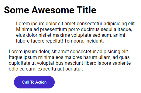
A lot of sites follow Inconsistent Alignment, with different alignments for the Navbar and the Main Content of the site. This leads the websites to look something like this:
The example below looks much more structured:
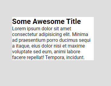
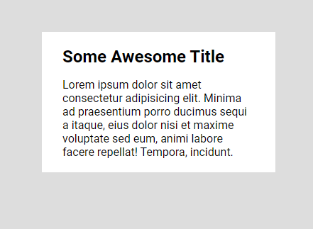
2. Space Out Your Content
This is one of the things you develop an eye for by default, as you gain more experience in developing more websites. As you can see here, the one with more spaced-out content looks much more professional.
NOTE: More spacing isn’t always what is required, for example, you can get away with little spacing between the Title and Date in the case of a Blog website.
Something that goes hand-in-hand with the previous point, maintain consistent spacing: the padding/margin in the left & right sides should be equal, same is the case for the padding/margin in the top & bottom.
3. Color and Contrast
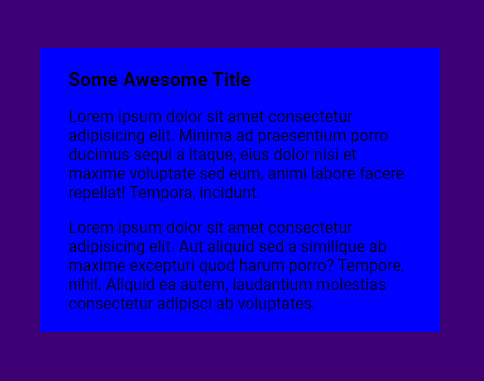
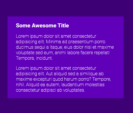
Color is an inherent part of design and is simply the most important thing to keep in mind while developing a modern UI, without proper Color & Contrast, even the websites with the best UI end up looking like crap. You can see the significant improvement in the picture below, just by changing the colors:
You can use Tools like Coolors to generate colors that go well with each other. It’s a good idea to limit the number of colors you use to Two (you can very well use different hues of the same colors and some generic colors like white, black & grey).
For Web Accessibility, WCAG 2.0 level AA requires a contrast ratio of at least 4.5:1 for normal text and 3:1 for large text. WCAG 2.1 requires a contrast ratio of at least 3:1 for graphics and user interface components (such as form input borders). WCAG Level AAA requires a contrast ratio of at least 7:1 for normal text and 4.5:1 for large text.
To check your Website’s Accessibility, you can use tools like Lighthouse (from Chrome Dev Tools) and Wave.
4. Typography
You can easily get away with using only one Font Family for your entire website. At most you should try to keep the Font Families limited to Two as using multiple fonts can easily overwhelm the user and even make the website look unstructured and unprofessional.
5. Visual Hierarchy
Visual Hierarchy is also one of the most crucial components of an amazing UI. There is a great quote by a Great Developer (read: By Me 😜):
A great developer is someone who makes implied actions evident
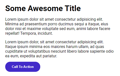
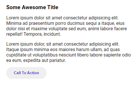
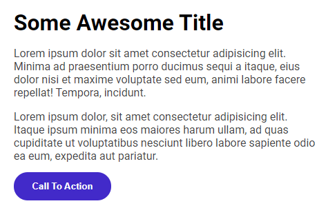
Visual Hierarchy is used to highlight certain parts of the Website which you want the users to focus on. You can employ several tactics for making users focus on a part of the site.
No Focus
Focus using Contrast
Focus using Color
Focus using Scale
Focus using Contrast, Color & Scale
Visual Hierarchy provides information to the users where they should look at
In this example, it’s not evident in one glance where we should focus our attention on. This can easily be improved by making some minor changes:
Source: https://dev.to

