©2021 Reporters Post24. All Rights Reserved.
Google recently rolled out the new unified interface for the free version of its app ecosystem. I showed you how to enable that redesign in, How to enable Google’s unified Gmail interface, but that focused on the desktop. Once you’ve enabled the new UX, you’ll find it carries over to the mobile platform as well. What Google has done with the mobile take on the unified interface is create a platform that makes it incredibly simple to do all the things from a single location.
Google is obviously trying to compete with the likes of Slack and Zoom, with a decidedly Google spin on things. Google has succeeded.
SEE: Electronic communication policy (TechRepublic Premium)
The new mobile unified interface makes for an incredibly efficient user experience, where you can do all the things in one location that you’d normally do in four. Once you’ve enabled the unified interface (which has to be done in the desktop version, as shown in the article above), you’ll have instant access to Gmail, Chat, Room and Meet. The four apps work seamlessly together, with an interface that is, as the name implies, perfectly unified (almost—more on that in a bit).
This was a smart move on Google’s part. They were getting hammered by the competition and it looked like Slack was going to come out so far on top of the business communication/collaboration world, that everyone else would spend the rest of their days playing catchup.
Not so now. Google has outdone Slack, and any business using Gmail will find themselves having to rely on the likes of Slack less and less.
That doesn’t mean Gmail is a complete drop-in replacement for Slack. It’s not. Slack still has features that Gmail will never have. For example, although you can integrate slash commands with Google Chat Bots, you can’t use them in a conversation. When you realize that Rooms allows you to do things like assign tasks, upload and create files, start video chats and schedule Calendar events, you’ll see that Google has your collaboration needs covered.
It also helps that the new unified interface is incredibly easy to use.
Let’s take a look.
What you’ll need
You’ll need to have the most recent version of Gmail (I’m running version 2021.05.16.380255809 on a Google Pixel 5) and the unified interface enabled from within the desktop version of Gmail.
How to enable the new interface
- Open Gmail on your mobile device.
- Make sure you’ve selected your Gmail account and tap the menu button in the upper-left corner.
- Scroll all the way down and tap Settings.
- In the Settings window, tap the checkbox associated with Show The Chat and Rooms tabs. This will enable the new tabs for the mobile app.
How to use the new unified interface
This is so simple, it’s actually self-explanatory. However, there is one caveat. Before I explain the caveat, let’s look at the new interface. Open the Gmail app and you should now see four tabs at the bottom of the window (Figure A).
Figure A

The new Gmail mobile unified interface is quite easy to use.
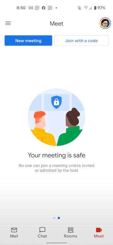
Tap any one of those tabs to switch to that particular service (Mail, Chat, Rooms, Meet). The only app that doesn’t share a nearly-100% similar UX is Meet. With Mail, Chat and Rooms, you’ll see a button at the bottom-right for Compose (Mail), New Chat (Chat) and New Room (Rooms). With Meet, you should see two buttons at the top, for New Meeting and Join With A Code (Figure B).
Figure B

The unified interface isn’t 100% unified in Meet.
Even though Meet doesn’t perfectly mirror what they’ve done with the other services, it’s still quite simple to use. Even with that slight difference, Meet remains integrated with Gmail, so you won’t have to open yet another app to use the service.
The caveat
The one caveat to using the unified interface with Gmail is that it only works with Gmail accounts. If you’re like me, and you have multiple email accounts configured in Gmail, you’ll find the new UI only appears when you switch to the Gmail account. That’s an expected behavior, but those new to the unified interface might get tripped up when they open Gmail and don’t see the tabs at the bottom of the window. Switch back to your Gmail account and they’ll be there, ready to serve.
This new Gmail UX is outstanding. For those who lean heavily on Gmail services, the mobile version of the unified interface will be a game-changer. You’ll find yourself working more efficiently and productively.
Source: www.techrepublic.com

