©2021 Reporters Post24. All Rights Reserved.
Apple has redesigned its Apple ID website, introducing an entirely new look that’s much more modern and clean than the prior design that was used.

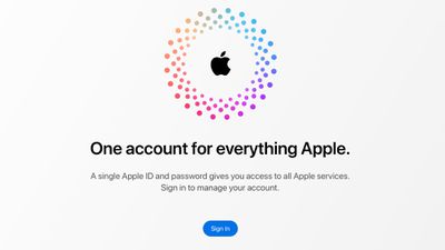
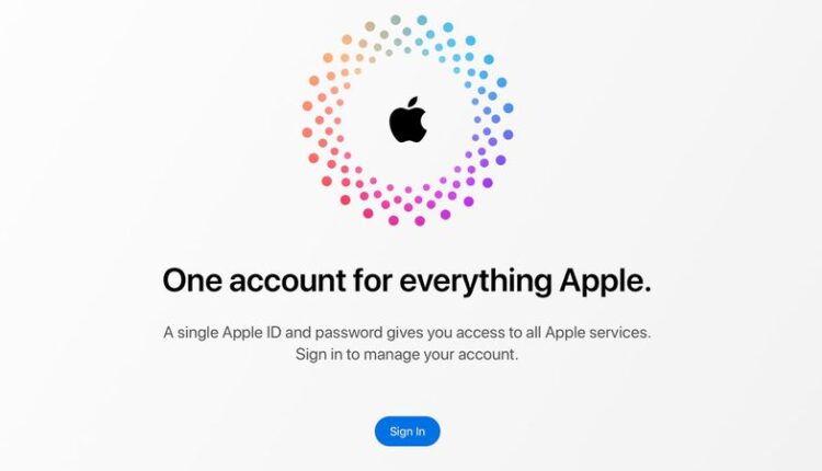
The Apple ID landing page has been updated with a new dot and Apple logo design, along with information on what the Apple ID website can be used for. The prior design was graphics heavy, featuring a large banner with people using various Apple devices.

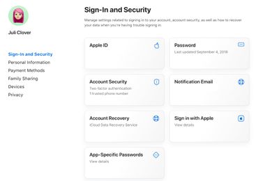
Logging in to the Apple ID website presents all of the available Apple ID management options in a card-style view, plus there are navigation options on the left.

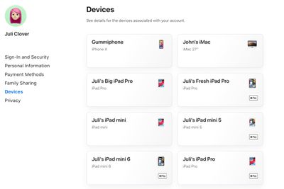
The card view offers information at a glance, like your Apple ID, your notification email, whether you have two-factor authentication enabled, and the last time that your password was updated. Clicking through the navigation options brings up more info like your name, birthday, reachable email addresses, device list, payment options, and more.
The entire website is simple, responsive, and easy to navigate, and it’s quicker than the prior website. The new look is a definite improvement over the previous design for those who need to manage their Apple IDs on the web. The new website design can be found at https://appleid.apple.com/.
Source: www.macrumors.com


